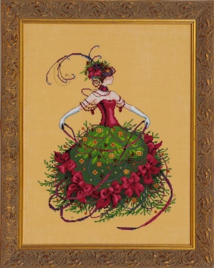
I love the pose of this lady, the fact that she is in motion and that the end result is, as often happens, spectacular. Unlike people who don't know how to consult the Mirabilia site to know what is used to make it, my complaint is for whoever produced the scheme. Let's start with the material, 4 silks are required, and while 196 (sable) night blue-dark brown-lighter brown-copper and 158 (grape) beautiful shades of dark purple-dark fuchsia-medium fuchsia-light fuchsia, they are absolutely necessary; 219 (cardinal) uses exactly the same reds of the bows apart from a very short more orange stroke, and you will use it right on the edge of the bows, and 232 (african violet) purplish blues similar to 341-340 that you will use as single points in a row and not you will never see a shade even paying for it, you don't need it, For the red you take either a silk with a more decisive thread or use a darker solid and really use the dmc because it is not worth it for 232. The scheme is frustrating, a the microscopic print starts, the format is already small on its own, but wasting half of the space available for instructions on both sides, the print of the diagram is small, difficult to read (I'm not telling you the joy in making the written point of the gloves) and let's not talk about the symbols, often very similar to each other. Probably one of the worst prints in my collection. But I repeat, the final product is as always wonderful. Rating: [3 of 5 Stars!] |

 English
 Français
 Español
 Italiano


